The Good Charts!!
Hi All,
Have you ever come across a dashboard which is meant for Executives, but it has many dropdowns and filters? Did your executives find it difficult to read the report? Mostly the answer will be YES!
Most of the time we make dashboards/reports without knowing the target audience. Knowing the target audience is one of the important criterions before designing the visualizations. I was fortunate to present before a batch of new hires the rules and best ways of communicating the data. I got a chance to read an incredible book: “Good Charts” by ‘Scott Berinato’. It helped me to develop the thinking of wireframing the visualization. I am adding the link to the presentation I created.
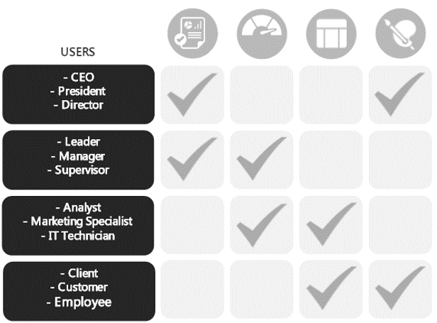
The below chart gives information about the target audience and preferred visualization. The report or infographic is the most preferred way to show results to executives as it gives a summarised view of the business at a glance.
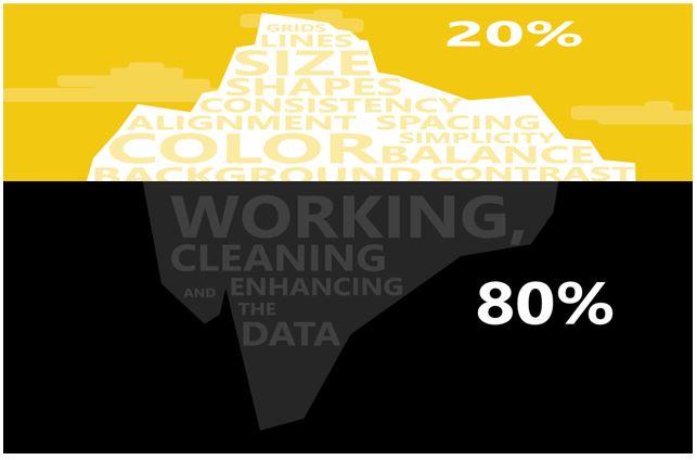
Data iceberg: Data visualization contributes 20% of the efforts, while data cleaning takes almost 80% of the efforts.
Please find the presentation at the Location
Thank you for stopping by!

Leave a comment